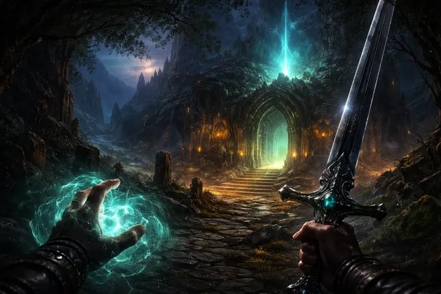
Avowed 完整評測:Obsidian 的沉浸式 RPG 王者之作,值得入手嗎?
Avowed 正式發售三個月後,本文從世界觀、戰鬥系統、角色扮演深度和技術面全面評析。Obsidian Entertainment 能否在 Bethesda 和 CD Projekt Red 之後,打造出屬於自己的 RPG 聖殿?
Avowed 正式發售三個月後,本文從世界觀、戰鬥系統、角色扮演深度和技術面全面評析。Obsidian Entertainment 能否在 Bethesda 和 CD Projekt Red 之後,打造出屬於自己的 RPG 聖殿?
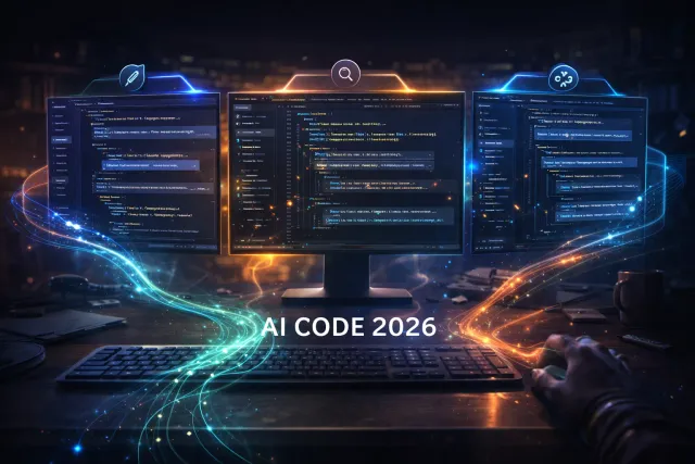
2026 年 AI 程式開發工具三強鼎立:Claude Code、Cursor 和 GitHub Copilot 各有優勢。本文從實際開發工作流出發,用具體數據和場景測試,告訴你哪款工具最適合你的需求。
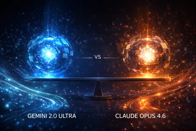
Google DeepMind 在 2026 年 3 月 3 日正式發布 Gemini 2.0 Ultra,主打原生多模態推理與百萬 token 上下文。本文用最新基準測試與實戰場景,帶你全面了解 Gemini 2.0 Ultra 的真實實力。
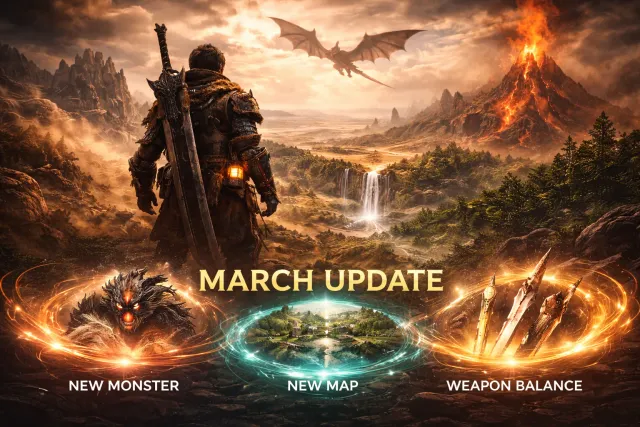
Monster Hunter Wilds 2026 年 3 月大型更新正式上線,帶來全新古龍「迷域龍」、新地圖「沉息谷」及大規模武器平衡調整。本文整理所有更新內容與最強武器配置推薦。
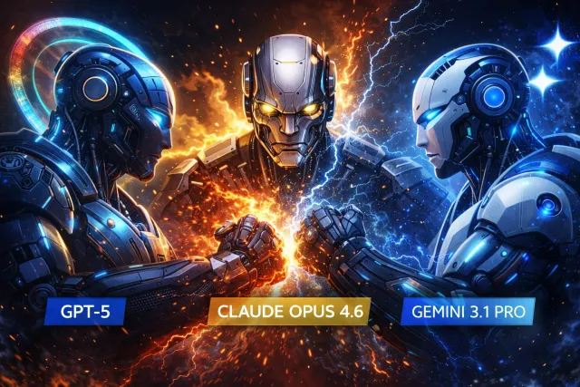
2026 年 2 月是 AI 競賽最激烈的一個月。GPT-5.3、Claude Opus 4.6、Gemini 3.1 Pro 同步較勁,DeepSeek V4 從側翼殺入。本文用最新基準測試數據,告訴你各模型的真實強項與最佳使用場景。
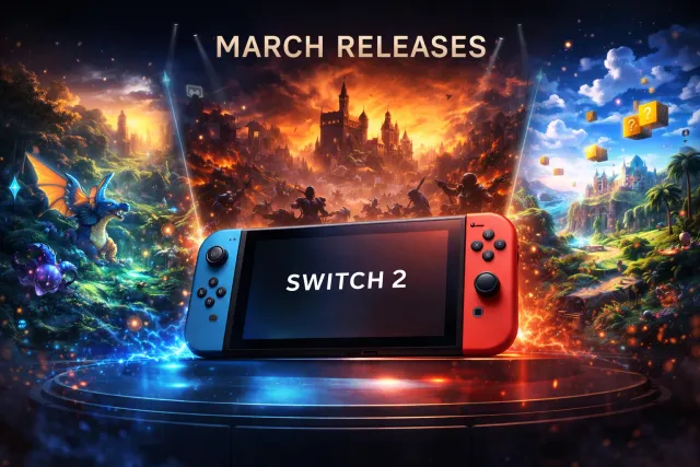
Nintendo Switch 2 三月陣容正式確定,Pokemon Pokopia、惡靈古堡:蝴蝶之殤 Remake、Monster Hunter Stories 3 等 8 款大作齊發。本文整理完整發售時間、遊戲亮點,以及 Switch 2 目前的熱銷現況。
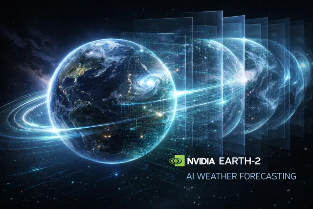
NVIDIA 發布 Earth-2,全球首個完全開源的 AI 天氣預報平台。三大模型涵蓋全球中期預報、局部暴風預測和大氣數據同化,將傳統超級電腦需要數小時的運算壓縮到幾秒鐘完成。

《人中之龍 極 3 & Dark Ties》於 2 月 12 日正式發售。本作包含經典重製與全新前傳兩款遊戲,新增龍宮流戰鬥風格、飆車女王模式和地下格鬥場。本文整理評測分析、系統詳解與新手建議。

Sony 確認 PlayStation State of Play 將於 2 月 12 日登場,長達 60 分鐘以上。Marvel's Wolverine 的完整展示、Marathon 最新進度、Naughty Dog 新作 Intergalactic 都可能亮相。本文整理所有已知資訊與預測。
AI 模型像黑箱一樣運作,沒人知道它為什麼這樣回答。機械可解釋性正在改變這一點。MIT Technology Review 將其列為 2026 十大突破技術,Anthropic 已能追蹤 Claude 從輸入到輸出的完整思考路徑。
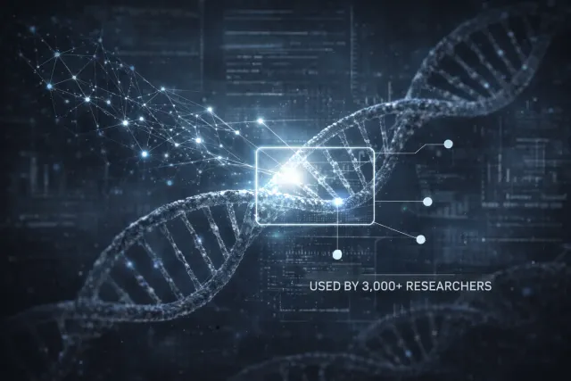
Google DeepMind 發布 AlphaGenome,能分析 100 萬個 DNA 鹼基對並預測數千種分子特性。論文登上 Nature,已有 160 國、3000 名科學家用於癌症與罕見疾病研究。本文完整解析它的運作原理與影響。
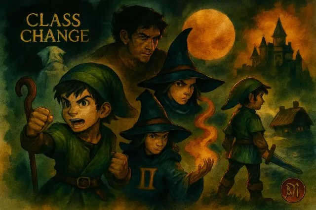
《勇者鬥惡龍 VII Reimagined》已正式發售,Metacritic 81 分、OpenCritic 85 分。本文深入解析全新 Moonlighting 雙職業系統、26 種轉職路線與新手推薦開局,幫你快速上手這款經典 JRPG 重製版。